A radical, accessibility-first redesign built to reflect Graeae’s values and empower users.
Graeae Theatre Company
Role
Design Lead
Agency
Cog Design
Services
Creative Direction
Web Design
User Experience
Graeae Theatre Company are champions of accessibility and inclusion in the arts, working with deaf and disabled artists.
Their previous website was no longer fit for purpose, crucially users with access needs couldn’t navigate the site effectively.
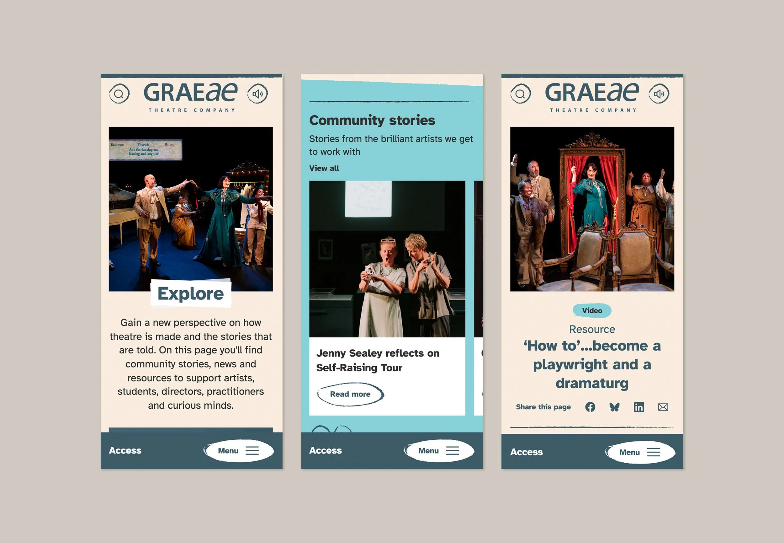
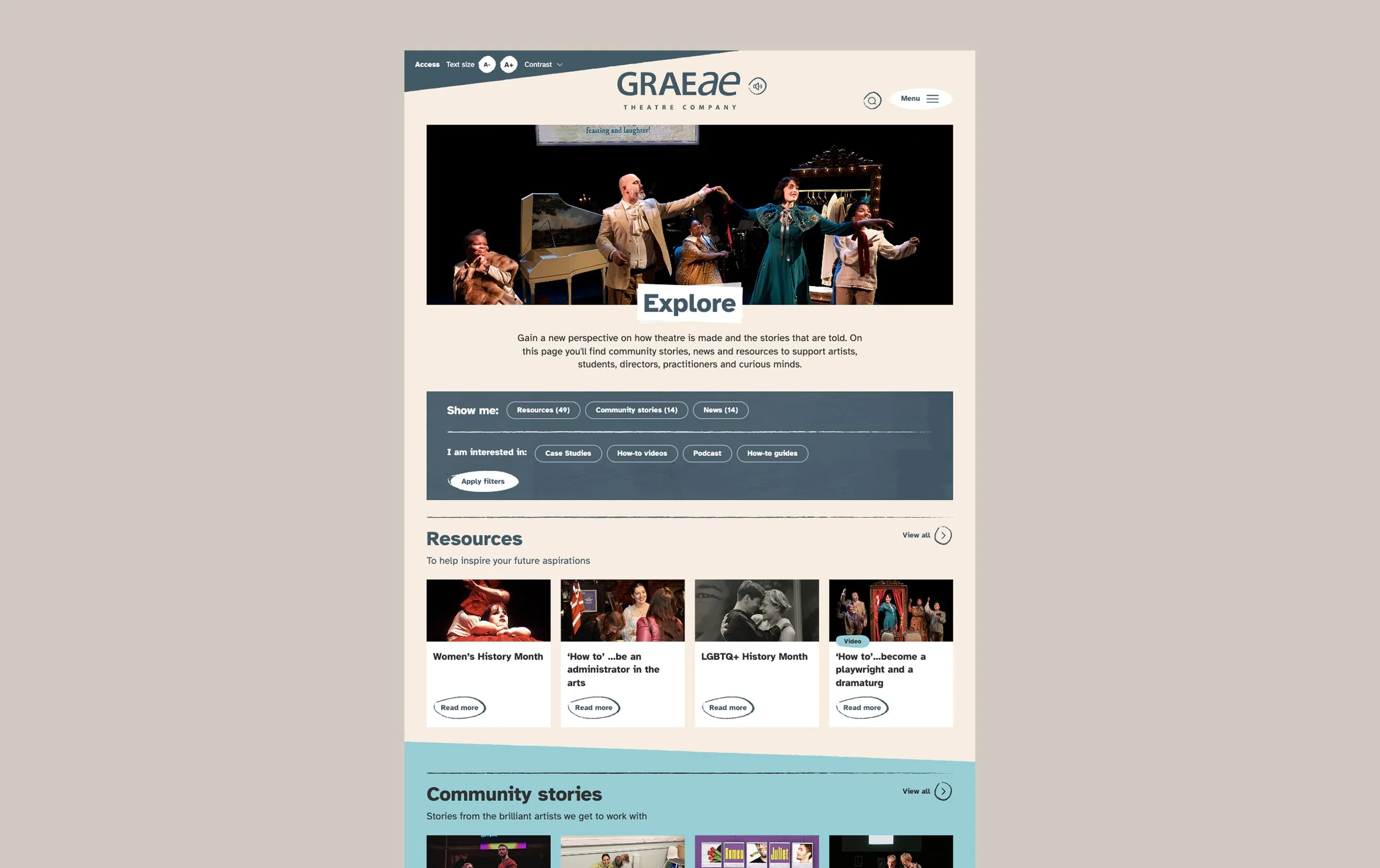
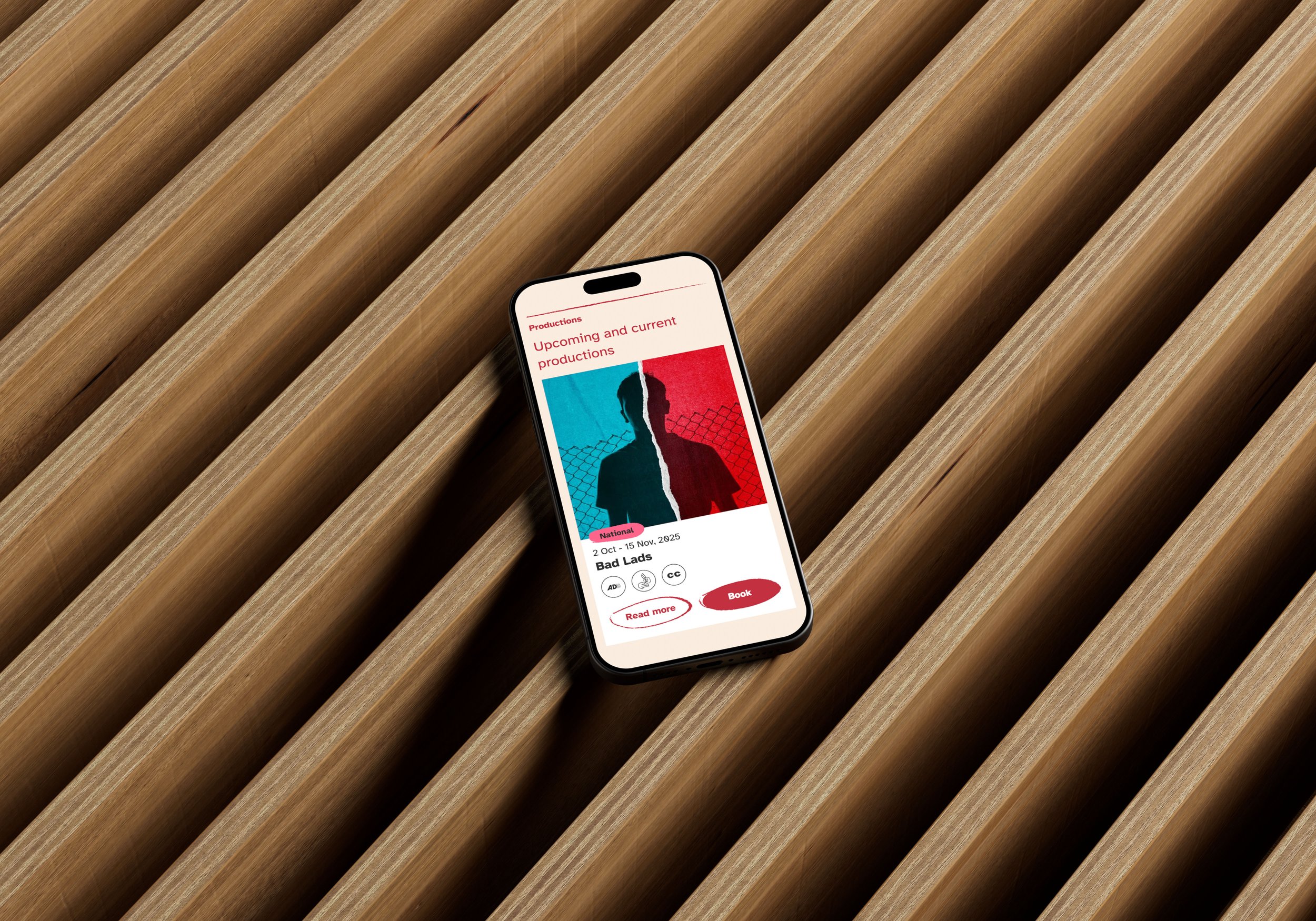
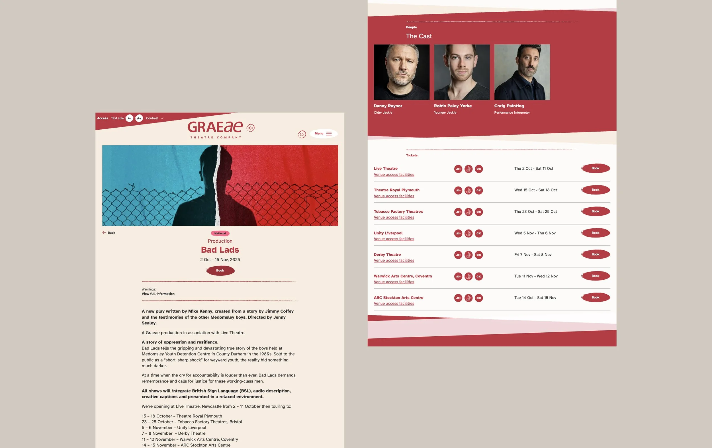
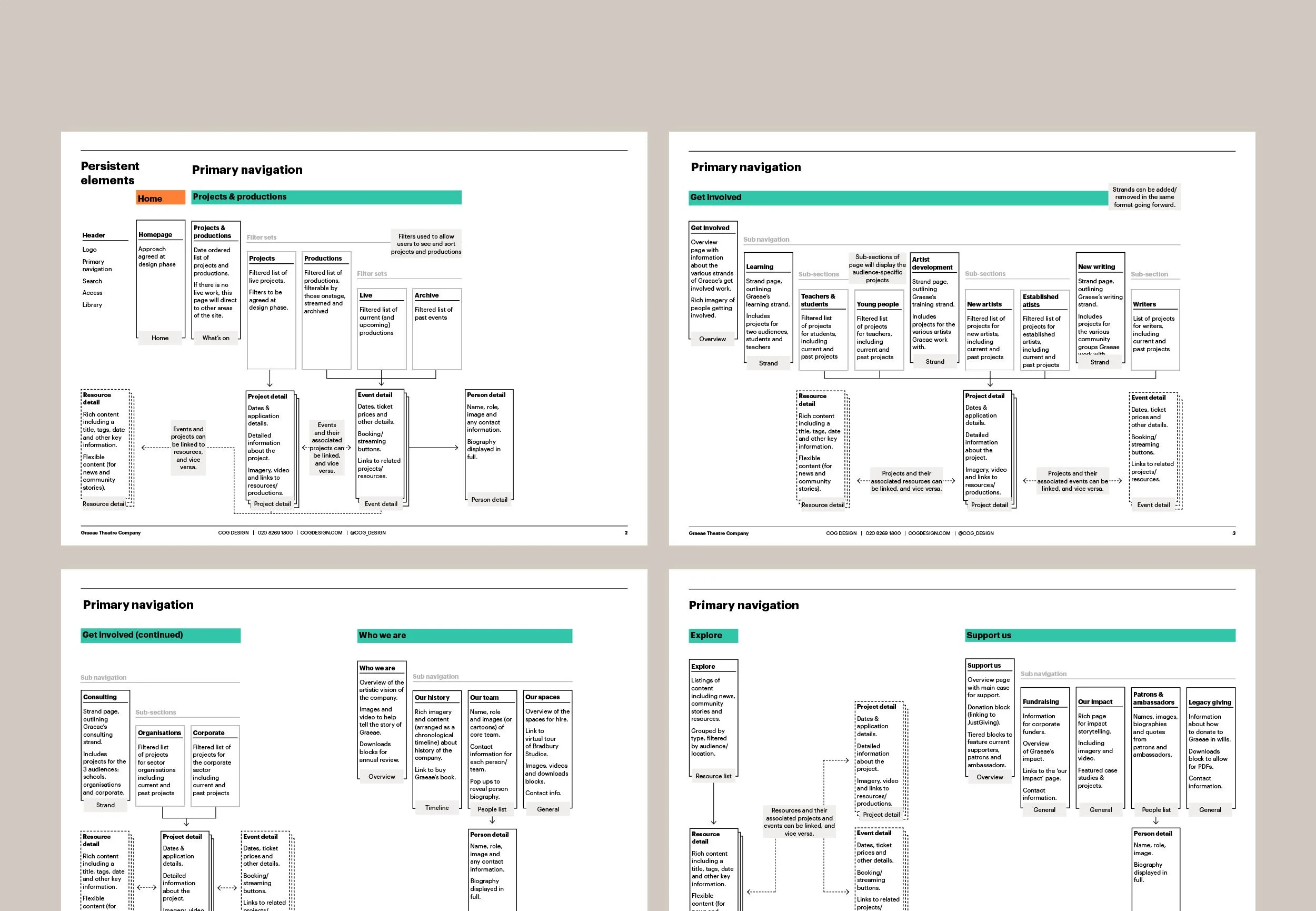
I led the design of their new website working with a small team with the goal of creating a flexible and accessible website that showcased their expanded offer of productions, community engagement work across the country and a resource library for creatives.
By asking the team to describe Graeae in a single word, the visual language was shaped to authentically reflect the organisation’s identity and values.
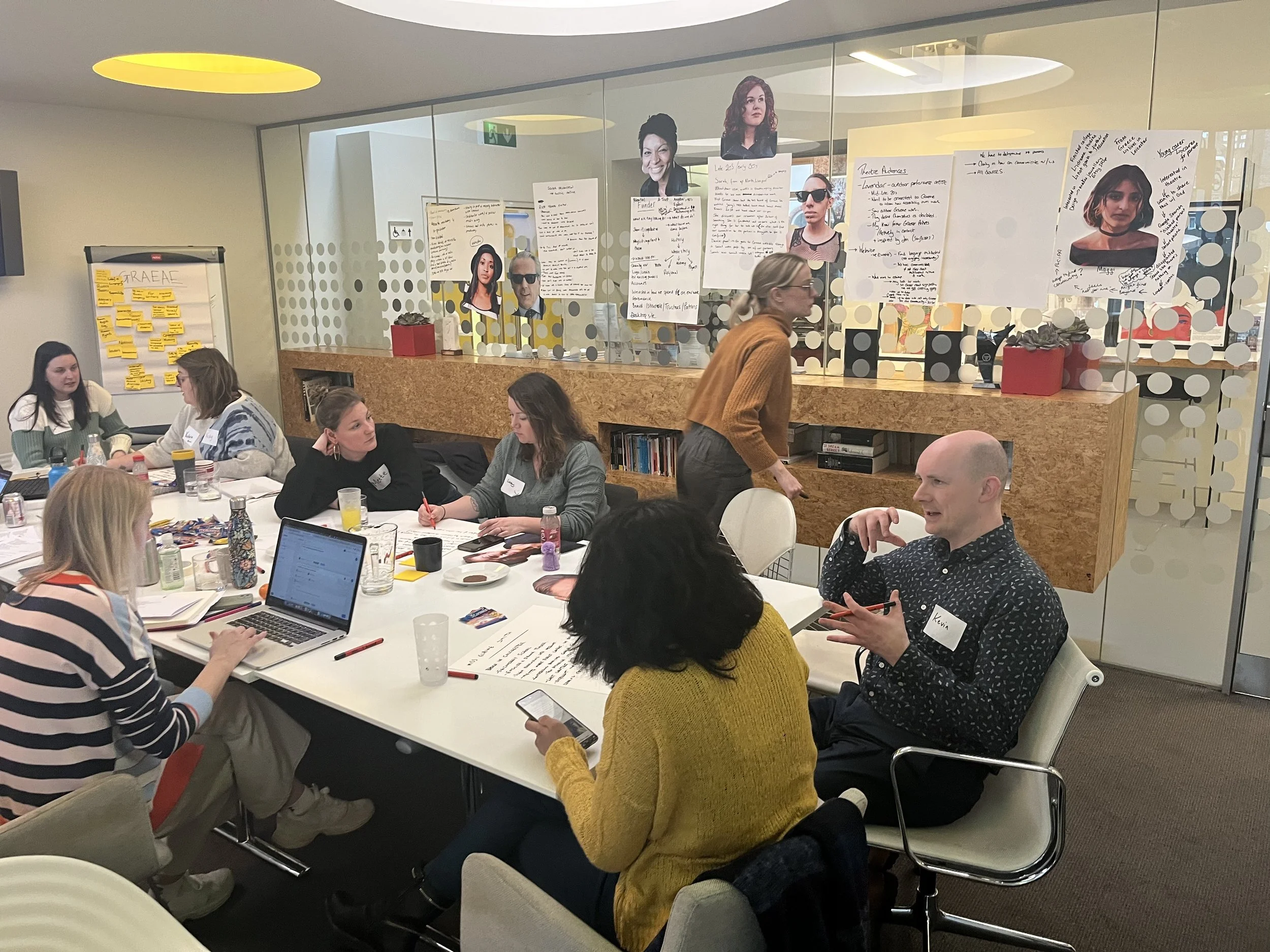
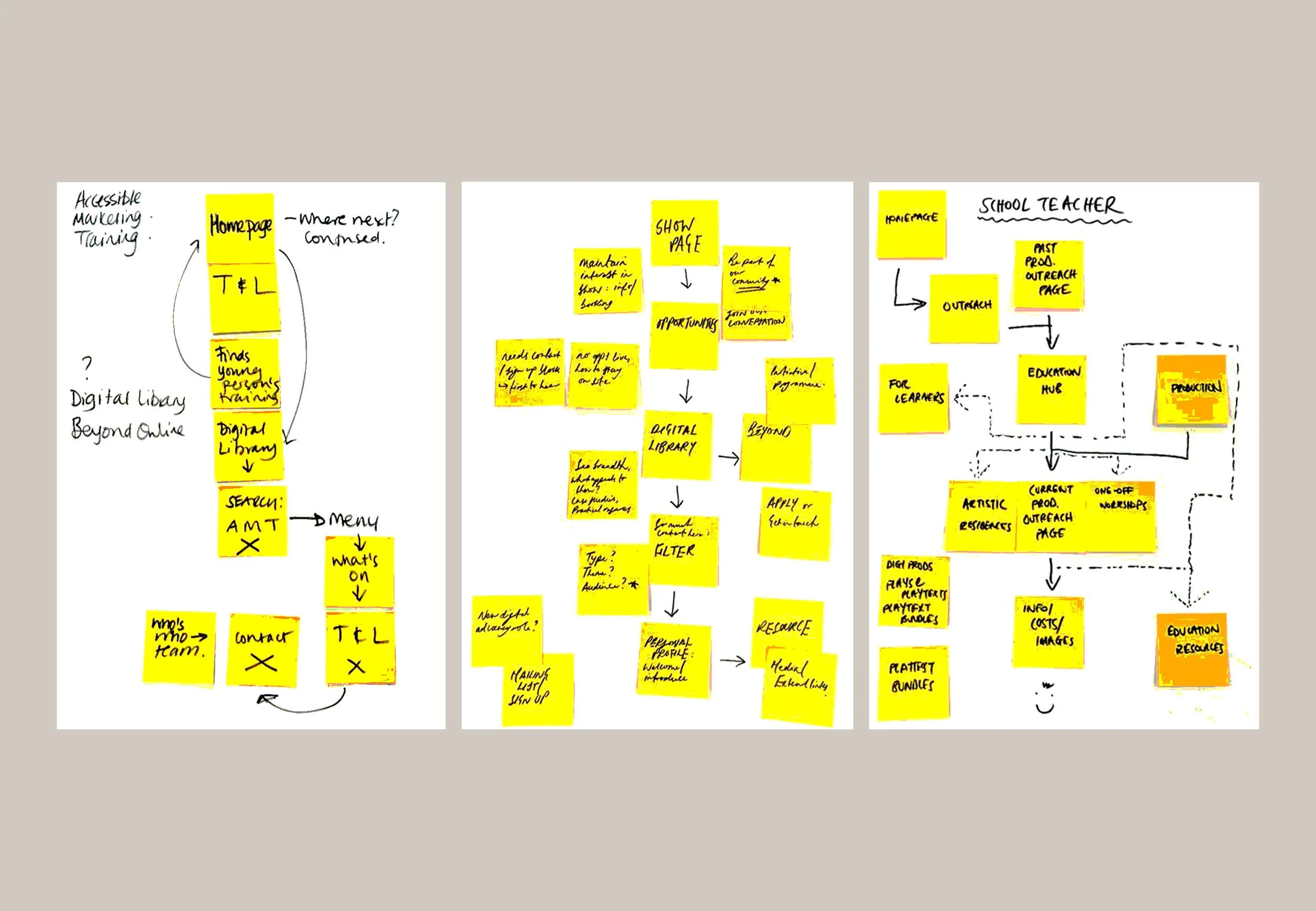
We began the project by hosting a workshop with the client to develop key user personas and map out user journeys. We asked their team to use a single word to describe Graeae, this gave a strong sense of the organisation and helped inform the design visual language.
After defining the site architecture to ensure the navigation reflected the changes to the organisation, and wireframing a flexible modular design system – the design process began with low-fidelity sketches and research.
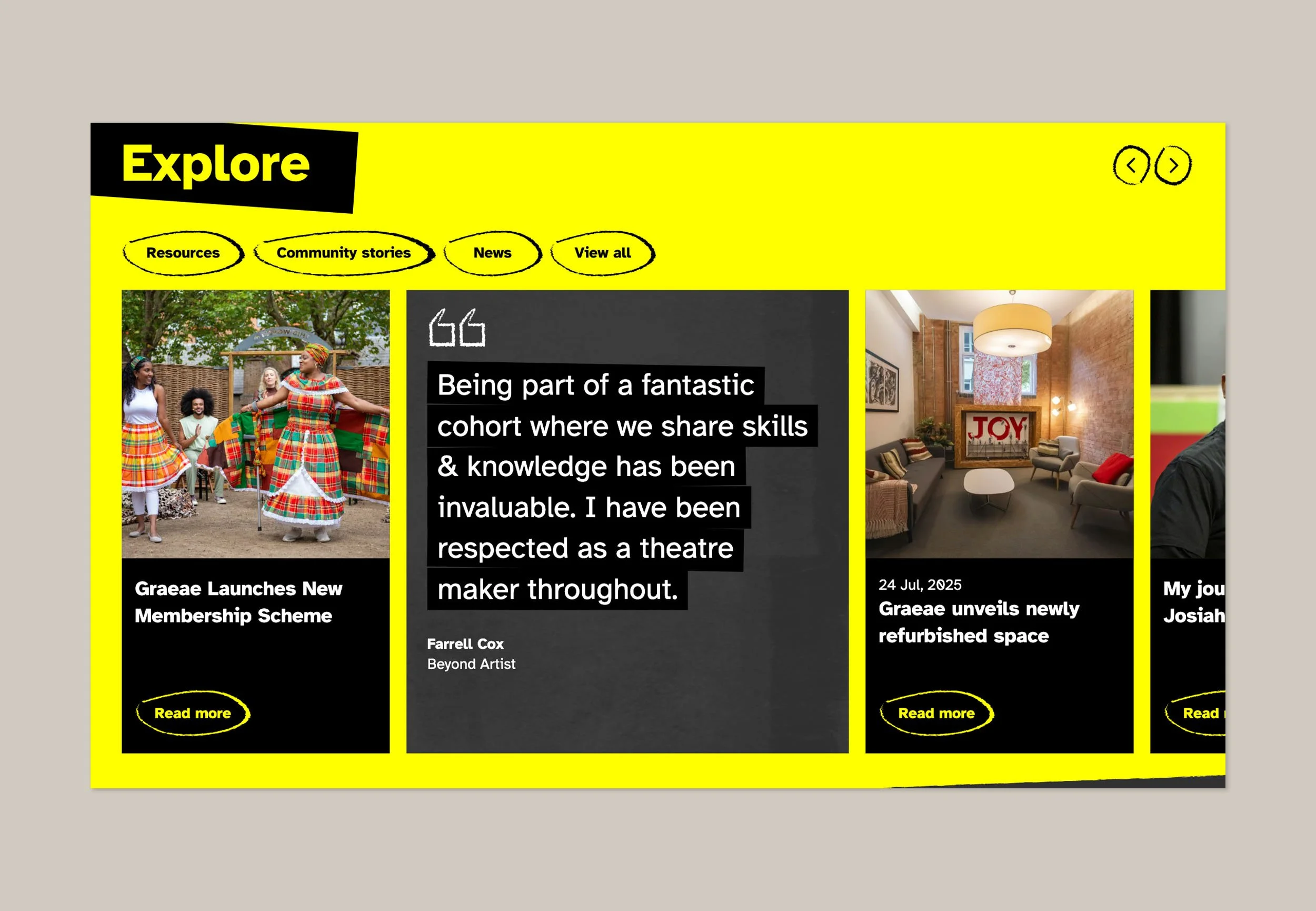
Achieving strategic visual storytelling by balancing bold, protest-inspired visuals with practical accessibility.
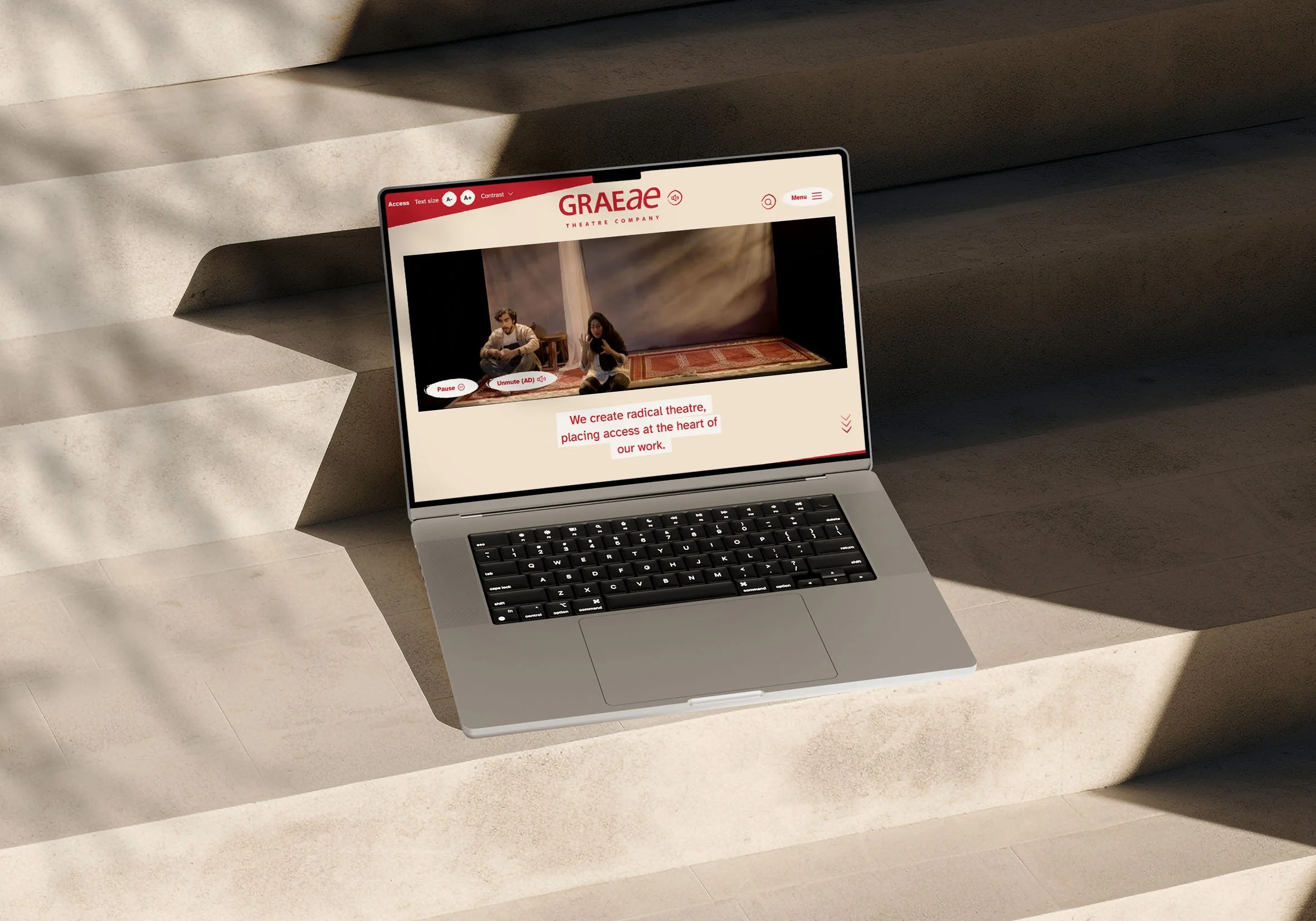
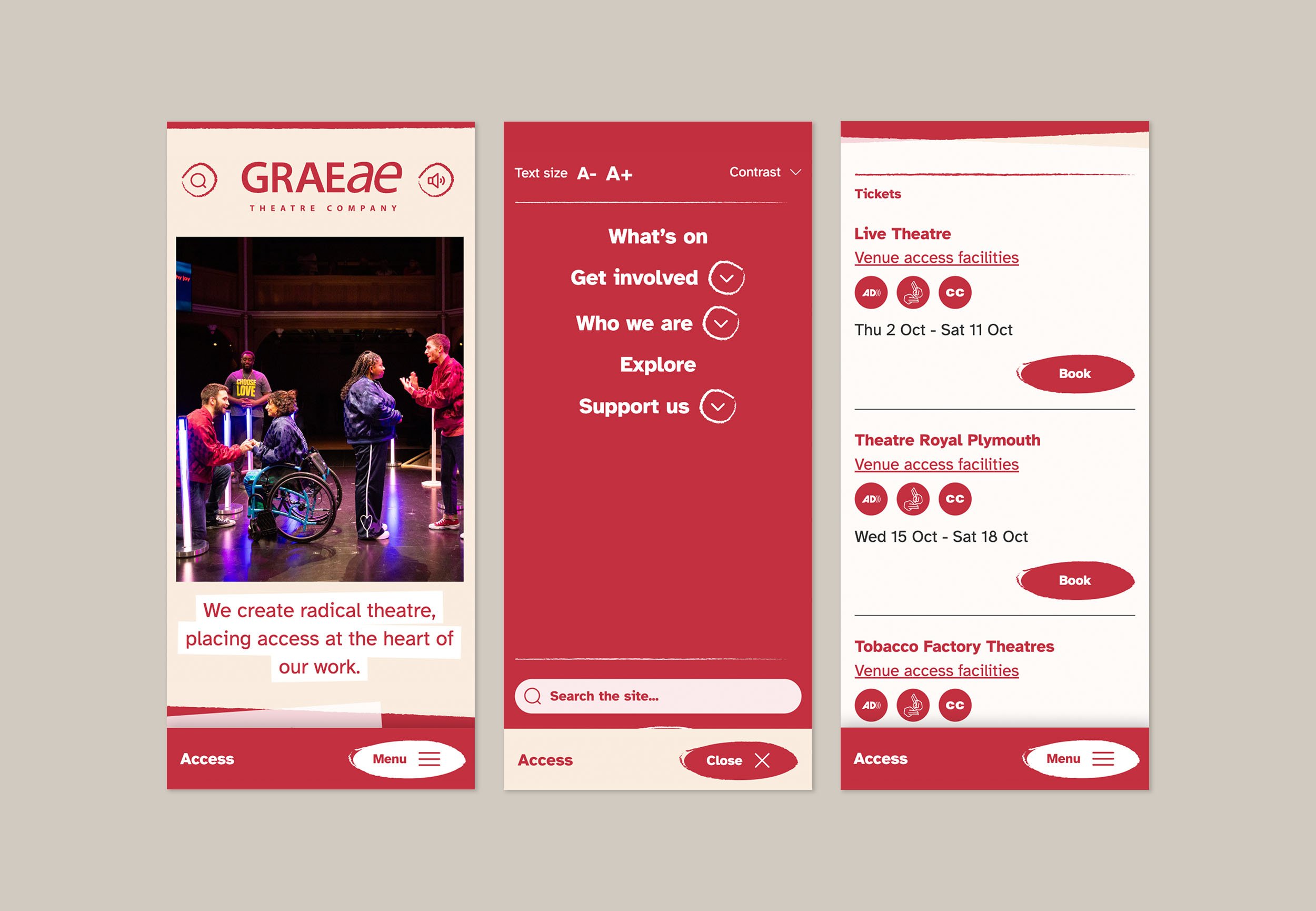
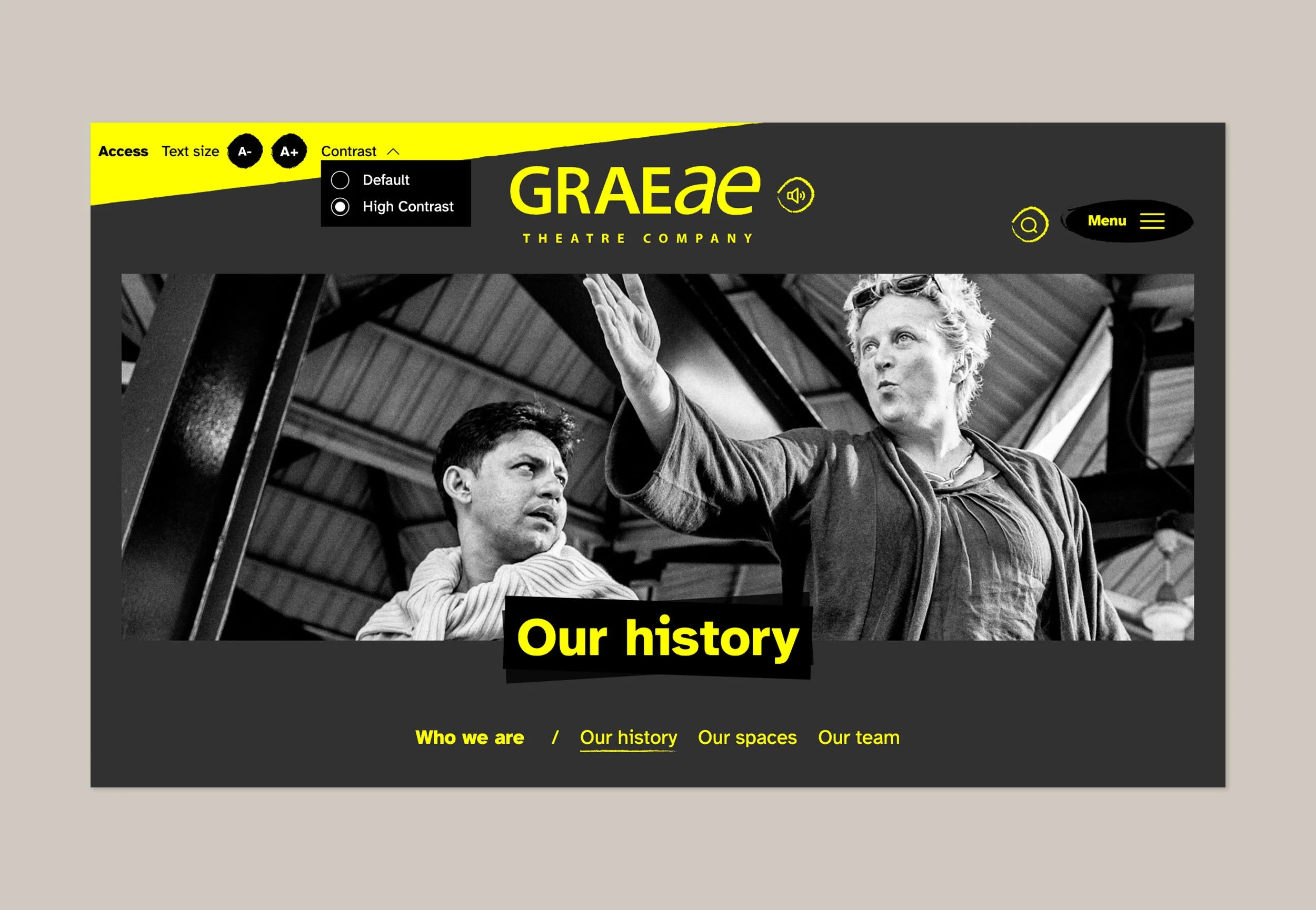
Typeface selection was one the first decisions in the design phase, opting for Atkinson Hyperlegible, developed specifically to increase legibility.
After working with the design team, I presented three distinct concepts to the client that explored different combinations of hierarchy, tone of voice, and layout. Emphasis differed between their story, expertise and breadth of work.
As the design evolved, every decision was filtered through an accessibility-first lens, whilst pushing the boundaries of a radical aesthetic that moved Graeae’s brand forwards. This was achieved by incorporating texture, panels and angles as visual cues to historical protest visual language. Paired with language, to ensure we captured an appropriate tone of voice to communicate Graeae’s mission and values.
The new site reflects Graeae’s values, improves access for all users, and supports their continued international reputation as pioneers of inclusion in the arts.
After designing a flexible modular system, a component library was handed over to development. Throughout the build phase, I maintained close communication with the developer to refine accessibility and test interactions.
Following extensive testing with an accessibility consultant and user groups representing a range of needs, the new site successfully passed WCAG 3.0 accessibility standards.
Leading a project where accessibility wasn’t an afterthought but the core design principle from day one has improved my approach to design, deepening my understanding of inclusive design practices.
The balance between a stronger visual identity aligned with Graeae’s values, and practical usability was challenging and rewarding to get right. The reputation of Graeae Theatre Company continues to excel internationally with their new fit for purpose website.