A digital transformation that unified three venues under one brand and reinvented the booking experience.
Capital Theatres
Services
Creative Direction
UX/UI
Role
Design Lead
Agency
Cog Design
Capital Theatres is a cultural institution in Edinburgh, comprising three venues: Festival Theatre, King’s Theatre and Studio Theatre.
Whilst King’s Theatre underwent refurbishment, this marked an important period to unify the venues and improve public awareness under Capital Theatres with a new identity created by Rose Design.
I led the redesign of the website, working closely with the client and overseeing the design team to ensure we delivered a cohesive brand experience.
In addition to the marketing site, a key part of this project and core focus of mine was designing a bespoke booking pathway that simplified buying tickets, added personalisation, and enabled dynamic upselling of memberships and donations. The legacy booking pathway felt clunky and left both users and the client heavily frustrated.
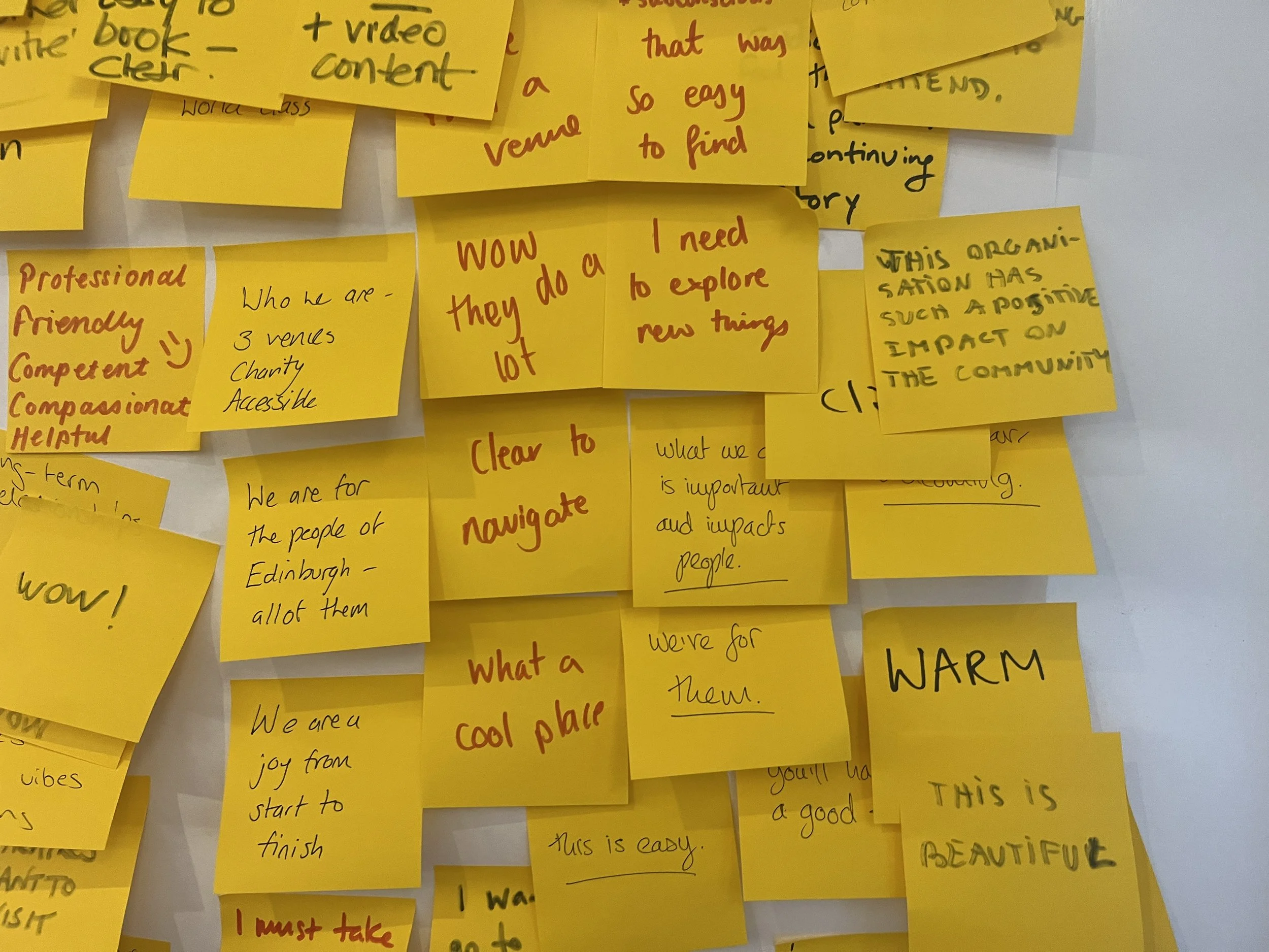
By identifying pain points with users, we used that data to streamline the flow, tailoring journeys to real user behaviours.
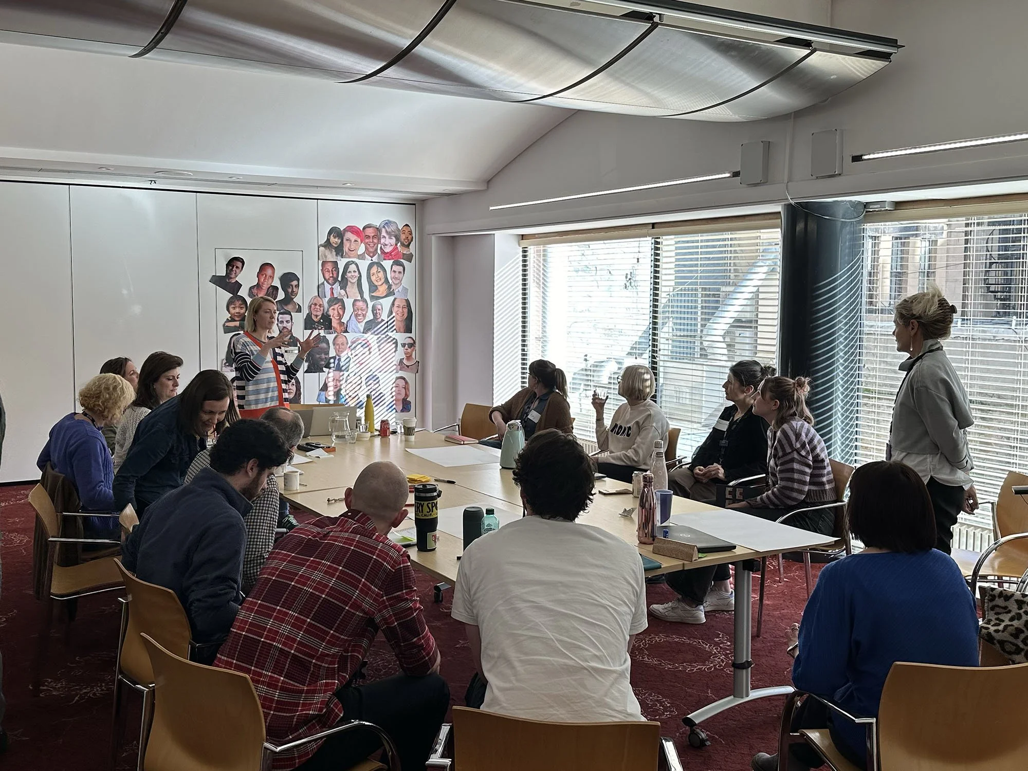
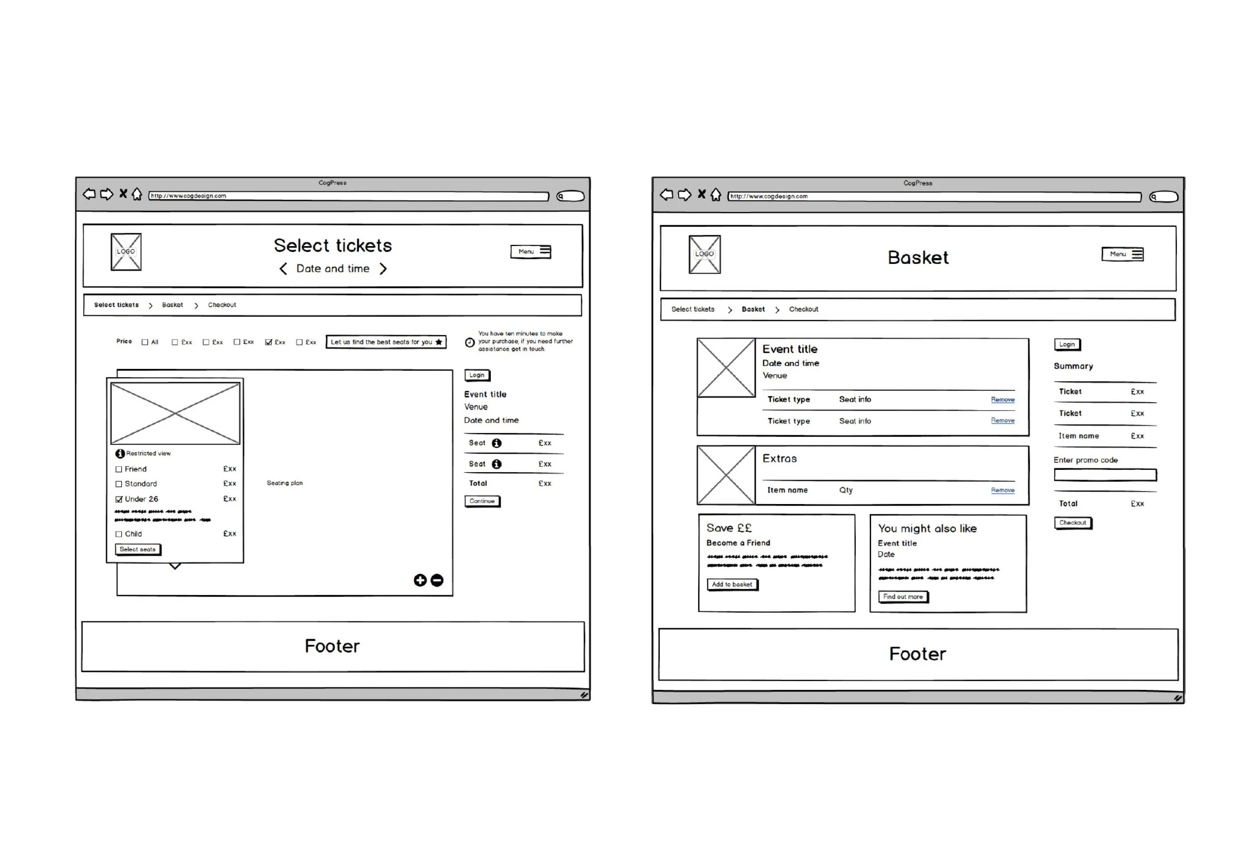
We ran a workshop with the client to define core user personas, including theatre bookers, community groups, and patrons. This led to mapping user journeys with a particular focus on booking, creating numerous iterations of wireframes to condense the pathway as much as possible and incorporate upsells.
To inform our approach, we also conducted an analytics report of the existing site where we were able to gather data about traffic and drop off rates during the booking pathway.
Dynamic, personalised membership prompts and donation options were woven into the booking flow, to boost both revenue and relevance.
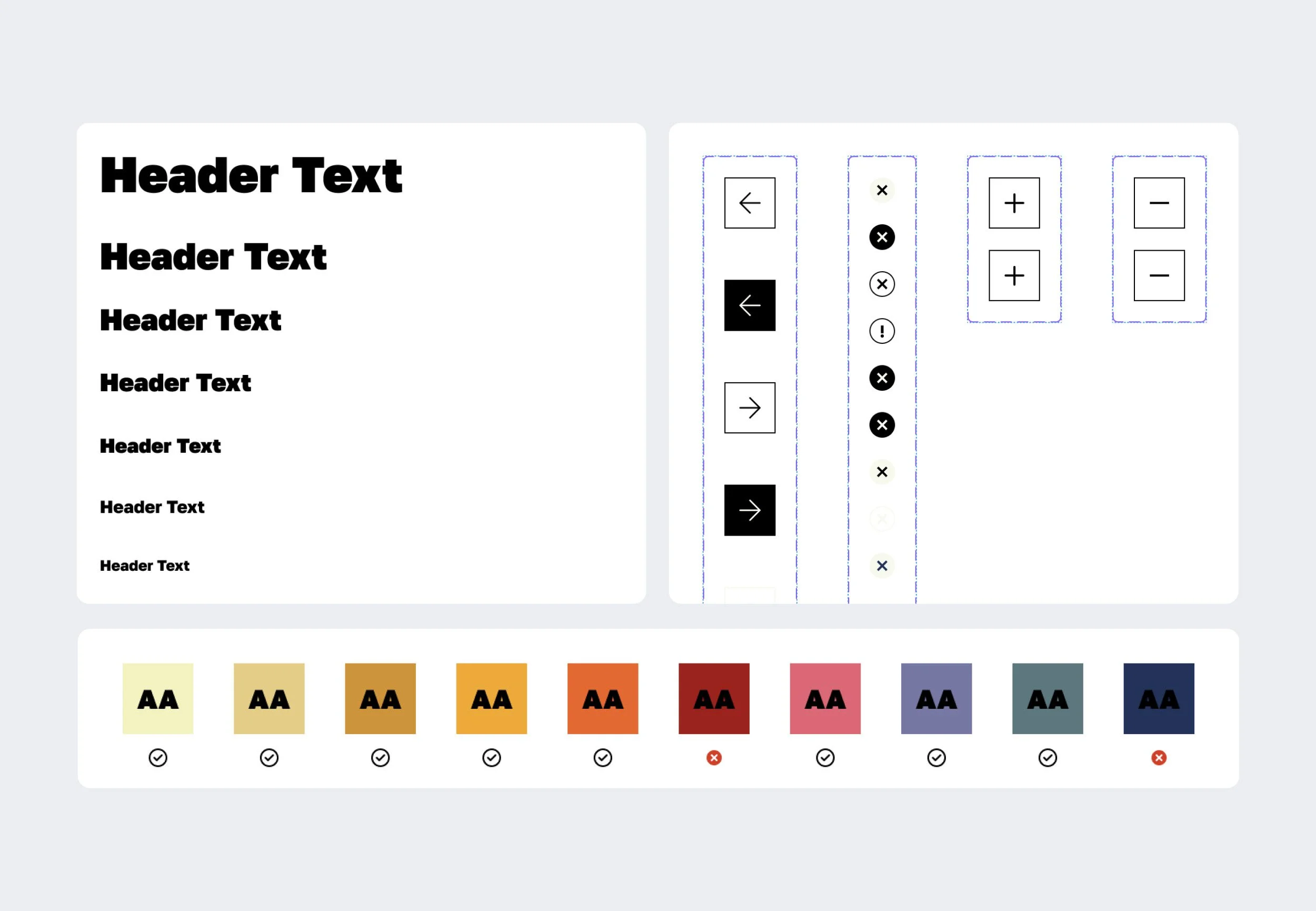
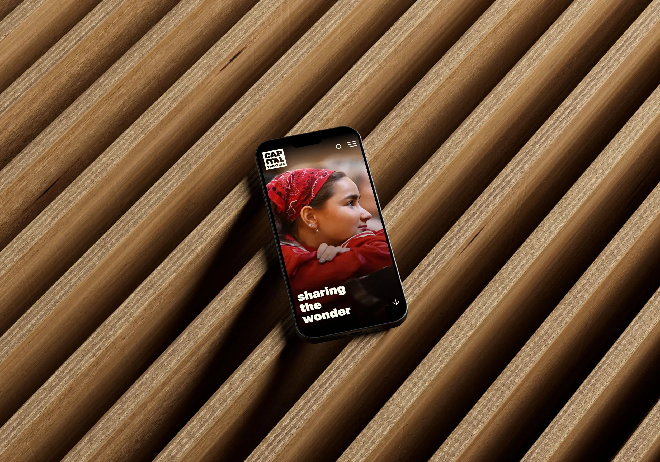
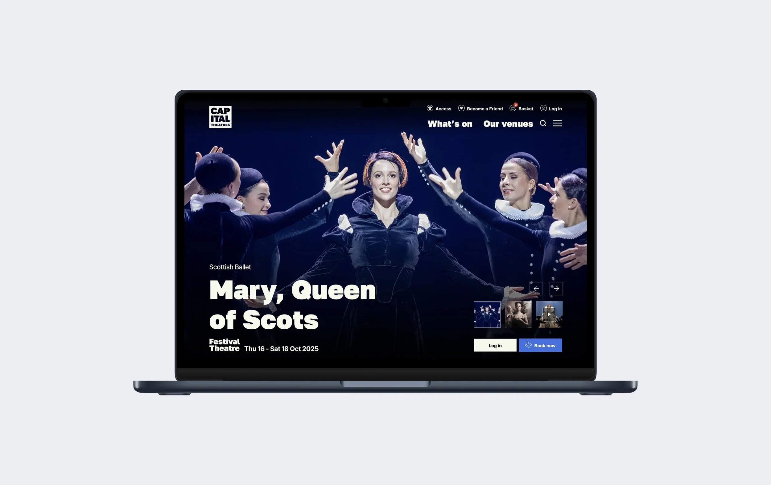
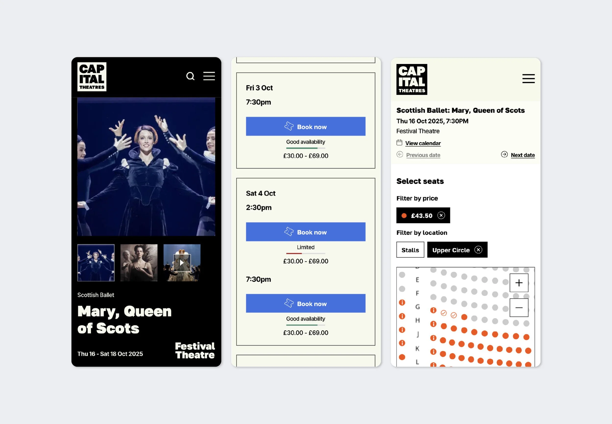
With the rebrand by Rose Design already in place, we were able to move swiftly into design of the website building an extensive design system and component library. We leaned into a neutral palette to give each venue’s identity space to shine, and gave the show imagery centre stage.
The booking pathway was designed at a later stage in the process. Throughout both the design and development phases, we worked closely with the development team to navigate challenges posed by limited API customisation. By adapting our designs accordingly, we were able to prioritise user experience while staying true to our original vision.
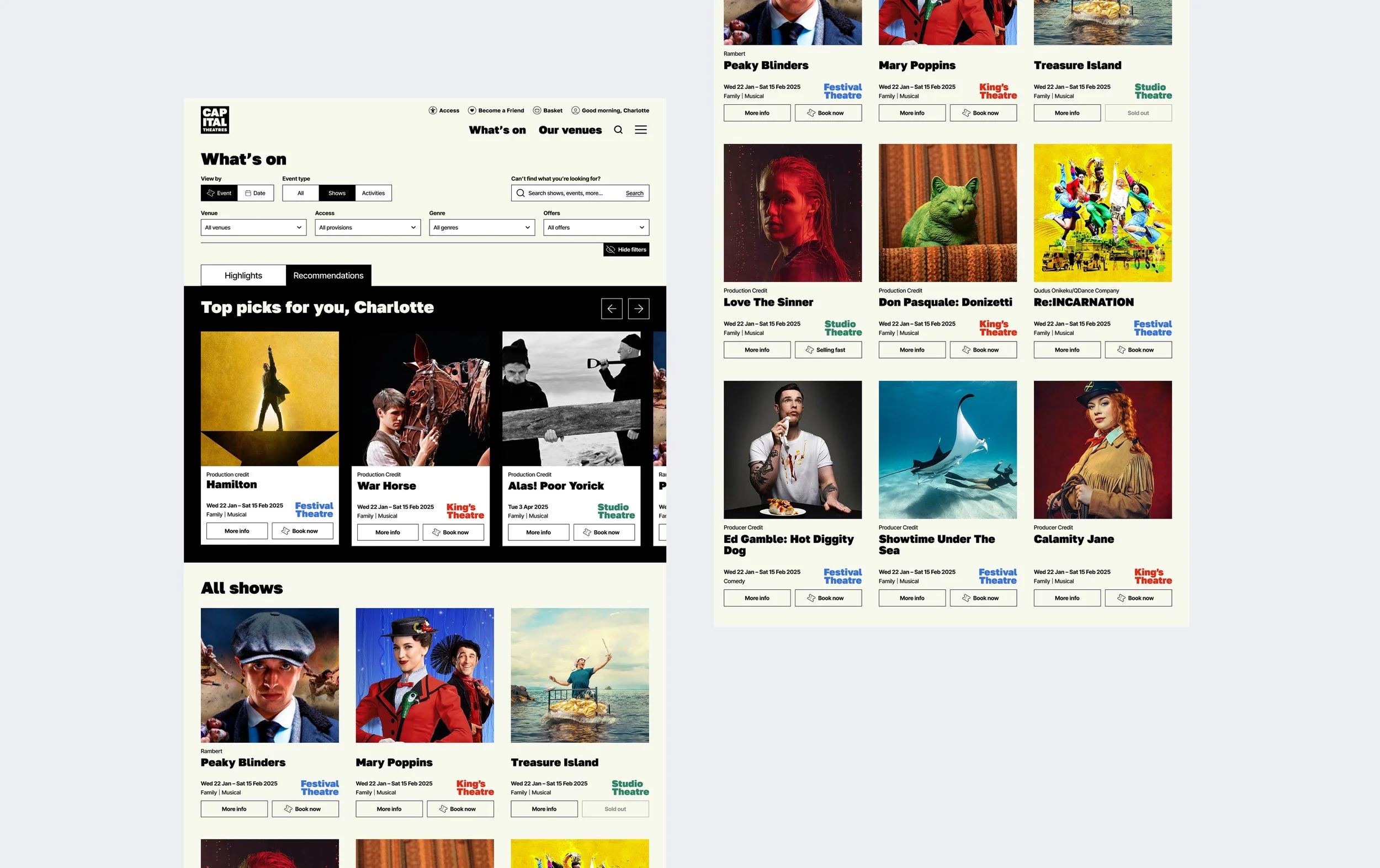
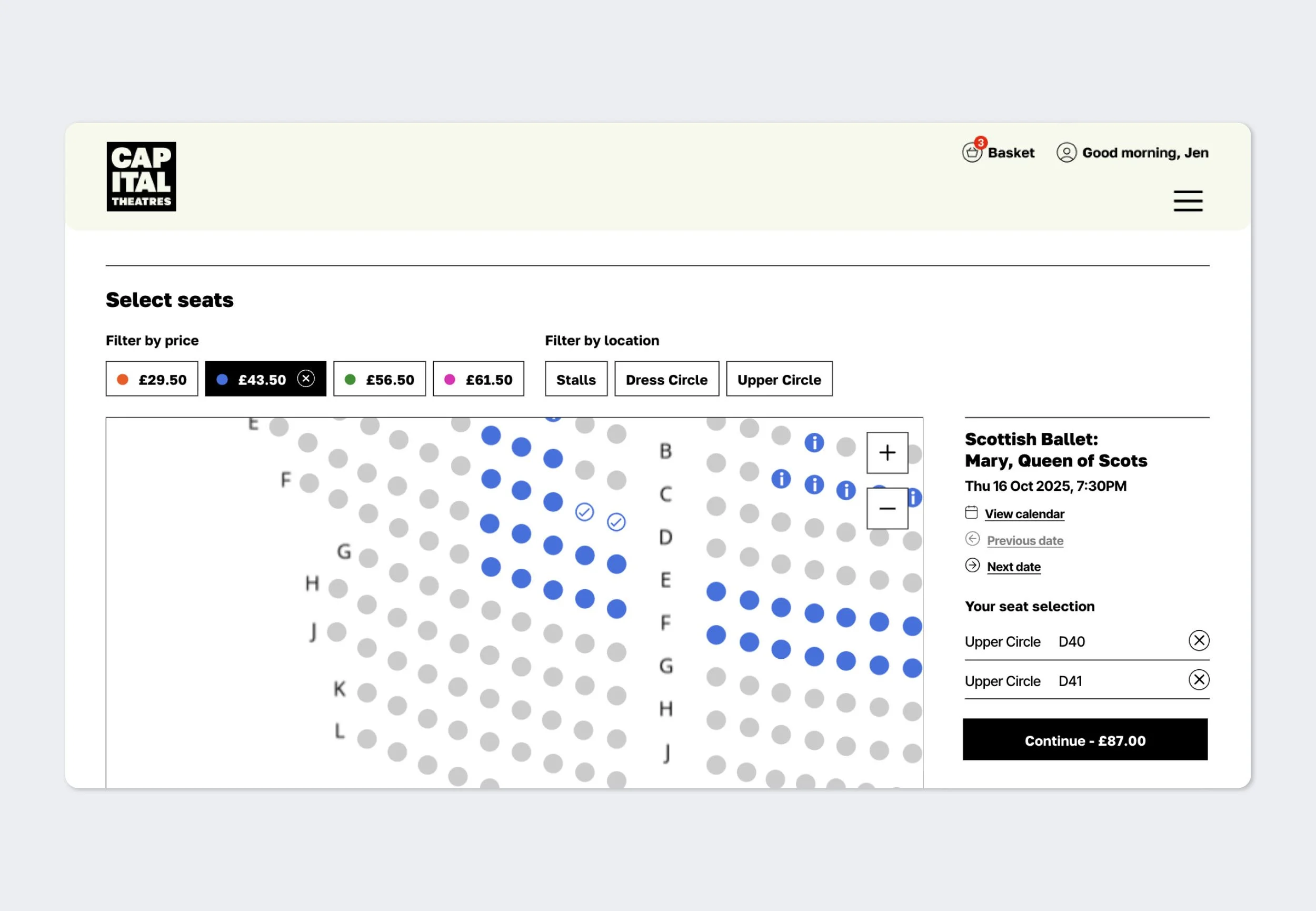
The resulting user interface creates a clear and intuitive transactional flow, guiding users effortlessly through the booking process.
Features include:
Ticket availability status on the instance list
Filterable seating plan by date, price and location
Categorised upsell extras
Membership and donation upsells tailored to user account
Personalised account area
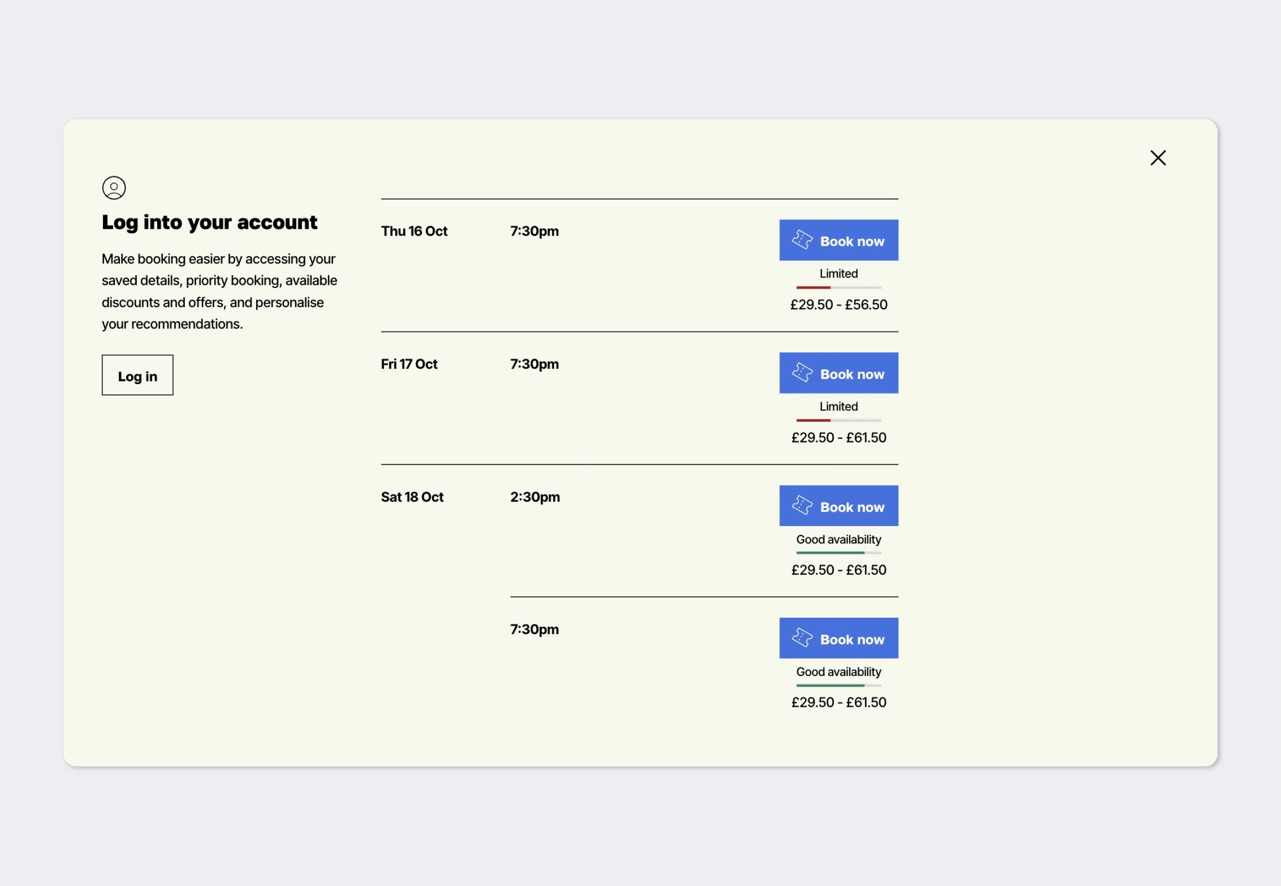
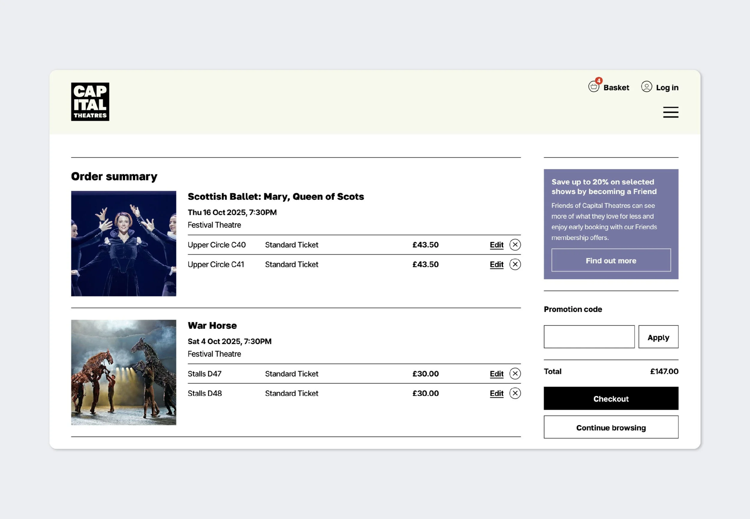
We rebuilt the booking journey – simplifying steps, reducing drop-off, and making buying a ticket feel effortless.
Leading this project was a big challenge and exceptionally rewarding. I enjoyed finding the balance between commercial goals, UX design, and technical limitations. I'm especially proud of the strong relationship we built with the client throughout such a large and complex project.